UTM · Human–Computer Interaction · 2026/27

Good interfaces
feel invisible.

We are The Ghosters. Across four project stages, we look for the small frictions people meet with technology—and design calmer ways through them.

✳
✳
✳▥●
✓
A project in progress We haunt the bugs,
not the users.
01 / 04Scroll to meet us

First things first · Project 0

Meet the Ghosters.

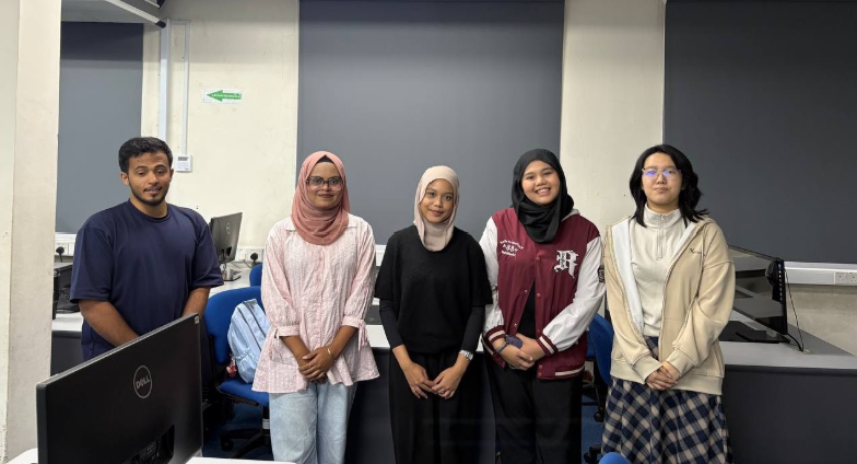
We create behind the scenes, so people can move through technology with less friction. Meet the five students behind the work.

Abdulrahman Khalid Al-Sheikh
01

Abdulrahman Al-Sheikh

Second-year Cybersecurity student who enjoys protecting digital systems and solving complex challenges. He sees cybersecurity as an intricate puzzle: connect the dots, anticipate threats, and make technology safer and easier to use.

HCI · Cybersecurity · Accessibility
Iznie Humaiera
02

Iznie Humaiera

First-year Computer Network and Security student. She describes herself as an INFP and enjoys playing musical instruments and reading.

Networks & Security · INFP
Hong Grace Enying, known as Grace Hong
03

Grace Hong

Hong Grace Enying is a second-year Computer Graphics student. She describes herself as an ENTP and enjoys playing games.

Computer Graphics · ENTP
Nursyakirah Jaan, known as Syakirah
04

Nursyakirah Jaan

First-year Computer Network and Security student, usually called Syakirah. She enjoys hiking with her family and listening to music.

Networks & Security
Nishat Tabassum
05

Nishat Tabassum

Second-year Computer Networks and Security student at UTM. She codes in C++ and JavaScript, enjoys thrillers and travelling, and cares about making technology simple and friendly for everyone.

Networks & Security · SECRH

Why “Ghost In UI”? The best interface often goes unnoticed when it works smoothly. Our motto is: “We haunt the bugs, not the users.”

The beginning · Group establishment

Project 0 set the stage.

Our first step was to form a team, give it an identity, and create a public home for the work we will publish throughout the semester.

00OUR FIRST POST

The Ghosters · Human–Computer Interaction

We haunt the bugs,
not the users.

Hello, and welcome to our HCI project journal. We are five UTM students exploring how thoughtful interface design can make everyday technology clearer, more inclusive, and easier to use.

Why “The Ghosters”?

A good interface often fades into the background: people can focus on their task instead of fighting the screen. We chose the name “The Ghosters” to represent that quiet work. We look for the small friction points hiding in an interface, then try to make them disappear.

Our motto is “We haunt the bugs, not the users.” Throughout the semester, this blog will bring together our team, our observations, and the ideas we develop across Project 0, Project 1, Project 2, and Project 3.

Group leader: confirm with the team before submission. This page is the group’s blog home.

THE GHOSTERS · OUR TEAM The Ghosters team standing together on campus

One team,
five perspectives.

✓ Team identity✓ First blog post✓ Member profiles✓ Group photograph○ Confirm group leader

Project 1 · Proposal

Checkout should
work for everyone.

01

Our project focus has shifted from restaurant ordering to the supermarket self-checkout kiosk. A teammate reported that a kiosk they encountered at AEON felt difficult to use. We treat that as an initial observation to investigate, not as a claim about every store.

See what gets in the way
1 Find or scan items2 Review the basket3 Confirm and pay

01 / Problem space

A small screen can
make a big shop harder.

Self-checkout asks shoppers to identify products, scan or search, resolve mistakes, and confirm a basket—often while keeping track of what they have already done. Clear steps, visible recovery, and accessible controls can make that process easier to follow.

Three usability problems

Where the flow
loses people.

The examples below focus on how kiosk screens, basket controls, and physical reach can affect a shopping task.

01

Finding an item

Crowded item lookup
and interruptions

Product categories, produce look-up, promotions, bag prompts, and scan guidance can compete for attention. When secondary choices interrupt the main task, shoppers must work harder to find and add the right item.

Design principlesVisibility · Constraints · Progressive disclosure
Usability goalsEfficiency · Learnability · Memorability
UX impact Too many choices at once can feel tiring, confusing, or pressuring.
02

Correcting a mistake

Hard-to-fix basket
and scan errors

A shopper may scan an item twice, choose the wrong produce entry, or need to change a quantity. If correction tools are hard to find, the person may have to repeat steps or ask staff for help.

Design principlesUser control · Feedback · Error recovery
Usability goalsSafety · Efficiency · User control
UX impact Unclear recovery can create worry about price, embarrassment, or loss of control.
03

Reaching and confirming

Small controls and
unclear feedback

Small touch targets, low contrast, unclear response after a tap, or controls placed beyond comfortable reach can make a kiosk difficult to use. Where a display is fixed high or controls sit near the top edge, wheelchair users or shorter shoppers may need to stretch or ask for help.

Design principlesVisibility · Feedback · Accessible interaction
Usability goalsEffectiveness · Safety · Inclusiveness
UX impact People may feel excluded when the kiosk does not respond clearly or comfortably.

02 / User experience

It is more than
getting through a screen.

At a busy checkout, people want to finish confidently and keep the line moving. Extra decisions can add mental effort; unclear recovery can make a simple slip feel costly; and a screen that is hard to reach or read can take away a shopper's independence.

These effects matter for wheelchair users, older adults and people with low vision, and shoppers who do not use self-checkout often.

Kiosk photo examples

Everyday kiosk
interactions.

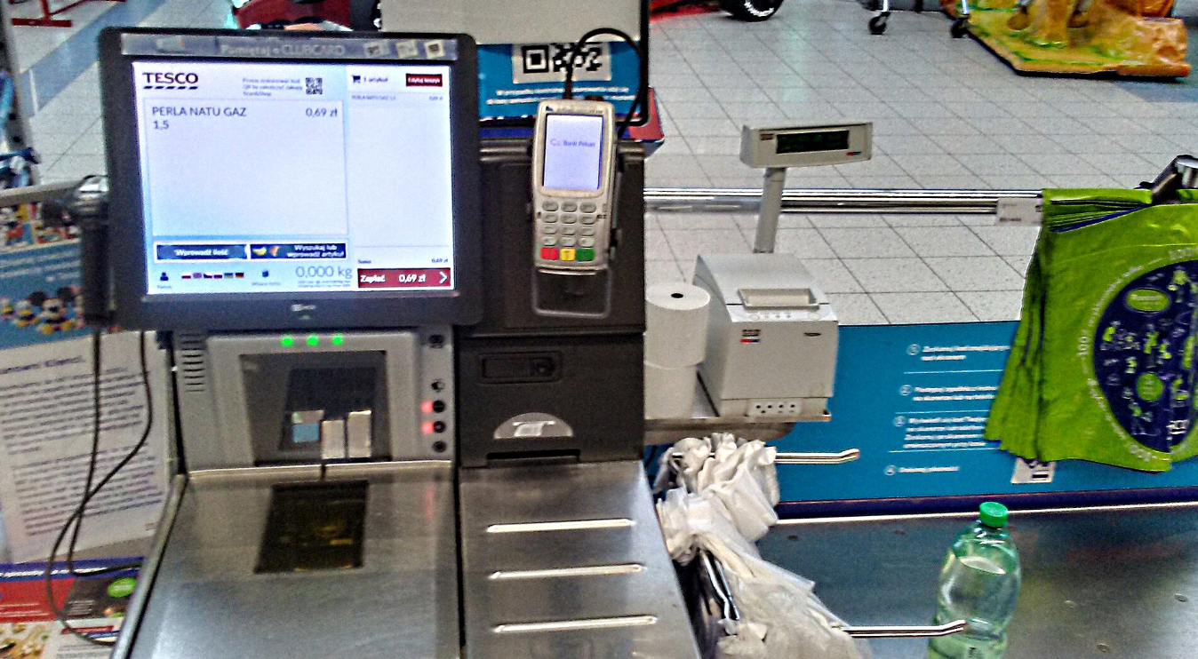
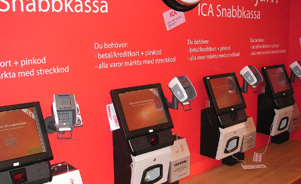
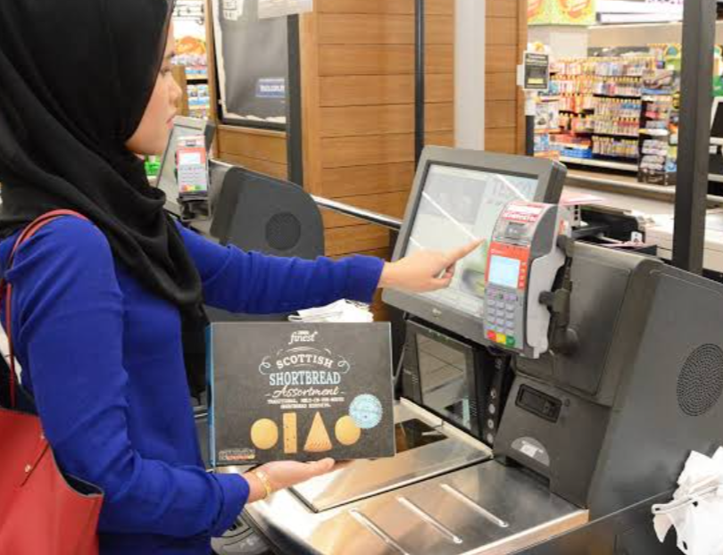
The images show checkout screens, station layouts, and physical interactions related to the usability problems described above.

Tesco self-checkout screen and payment terminal
Screen and payment controlsInformation and controls compete for attention.
A row of supermarket self-checkout stations
Checkout station layoutSeveral fixed kiosks share a busy checkout area.
A shopper interacting with a supermarket self-checkout
Touch interactionScreen position and touch response shape the experience.

03 / Proposed solution

Meet Grace MarketMate.

A supermarket self-checkout concept that keeps the next step clear, makes basket edits forgiving, and lets shoppers listen to spoken guidance if they want it.

Problem 01

Too much at once

→ Focus item search. Show essential information first and keep promotional prompts optional.

Problem 02

Hard to recover

→ Edit quantities, remove an item, and undo the last change directly in the basket.

Problem 03

Hard to reach or read

→ Offer a reach-friendly layout that groups key actions in a full-width lower panel, with larger controls, strong contrast, clear tap confirmation, and optional voice narration. Pair it with an adjustable, tilting display mount where the kiosk hardware allows it.

Concept interface · Try it

From scan to
sure of your basket.

This browser prototype uses sample items only. It does not scan barcodes, contact a store, or take payment.

GM
Grace MarketMateSelf-checkout concept
1 Add items2 Review basket3 Checkout

Step 1 of 3

Add your items

Scan a product or find it below. You can review every item before checkout.

The prototype illustrates the proposed interaction. It is not connected to a store kiosk or payment service.

04 / Target users

Designed around
real differences.

These groups are specific shoppers who may use a self-checkout differently. We will validate the needs through observation and feedback.

01

Wheelchair users
and people with limited reach

Reach layout groups key basket actions in a full-width lower panel with larger controls. Stores should pair the interface with an adjustable, tilting display where possible, then validate reach through observation with wheelchair users.

Reach · independence · feedback
02

Older adults and
people with low vision

Larger type, strong contrast, distinct touch controls, and optional spoken prompts can make product details and checkout steps easier to perceive.

Legibility · narrator · confidence
03

First-time and occasional
self-checkout users

Simple instructions, visible progress, and direct basket recovery help shoppers who do not already know where each control lives.

Learnability · recovery · clarity

05 / Sustainability connection

Inclusion is part of
good design.

Our contribution is a design proposal, not a measured sustainability outcome. The links below explain why the project is relevant.

SDG 10

Reduced inequalities

UN Target 10.2 calls for promoting social, economic, and political inclusion regardless of age or disability. MarketMate explores how a self-checkout can offer more people a clear, independent path.

Read Goal 10 ↗
SDG 12

Responsible consumption

UN Target 12.3 includes reducing food waste at retail and consumer levels. A clear basket review could help shoppers catch accidental duplicate or unwanted items; whether that changes waste needs to be tested.

Read Goal 12 ↗
UTM · ESG

Social and governance

The concept relates to UTM's ESG framing through accessible interaction (Social) and visible item, quantity, and price changes (Governance). Environmental impact is indirect and unverified.

Read UTM's statement ↗
02

Next stage

Project 2

Details will be added when the team receives and shares the Project 2 brief.

Coming soon
03

Later stage

Project 3

Details will be added when the team receives and shares the Project 3 brief.

Coming soon

Sources

Built on good questions.

Sources supporting the design principles and sustainability links in this proposal.

  1. 01
    Sweller, J. (1988). Cognitive Load During Problem Solving: Effects on Learning. Cognitive Science, 12(2), 257–285. doi.org/10.1207/s15516709cog1202_4 ↗
  2. 02
    W3C (2023). Web Content Accessibility Guidelines (WCAG) 2.2, Success Criterion 2.5.8 Target Size (Minimum). Used as an accessibility reference for the concept UI, not a certification of kiosk hardware. w3.org/TR/WCAG22 ↗
  3. 03
    United Nations, Department of Economic and Social Affairs. Goal 10: Reduced Inequalities. Target 10.2. sdgs.un.org/goals/goal10 ↗
  4. 04
    United Nations, Department of Economic and Social Affairs. Goal 12: Responsible Consumption and Production. Target 12.3. sdgs.un.org/goals/goal12 ↗
  5. 05
    Universiti Teknologi Malaysia. ESG Statement. sustainable.utm.my/esg-statement ↗
  6. 06
    Course materials. SECV2113 Human–Computer Interaction, Project Part 0 and Project Part 1 briefs, UTM Faculty of Computing, Session 2026/2027 Semester 1.